
WASH-Connect UX Audit
An audit of the usability and market position of WASH-Connect using expert and user evaluation methods.
.png)
Overview
WASH-Connect is a mobile app that allows for cashless payment in laundry rooms. As this was a group project, the following details outline my individual contributions throughout the project.
The goal of this project was to evaluate the WASH-Connect experience and make improvements to reduce user frustration and strengthen WASH-Connect's market position.
Role & Duration
UX Research, Expert Evaluation, UX Analysis
January 2026 - March 2026
📝 Cognitive Walkthrough
The goal of doing a Cognitive Walkthrough was to evaluate the learnability of WASH-Connect through the lens of a new user so that the friction points could be identified and fixed. We followed the full form because of its value for task-based flows and went through the user flow of starting a washing machine. Read more in the full report here.
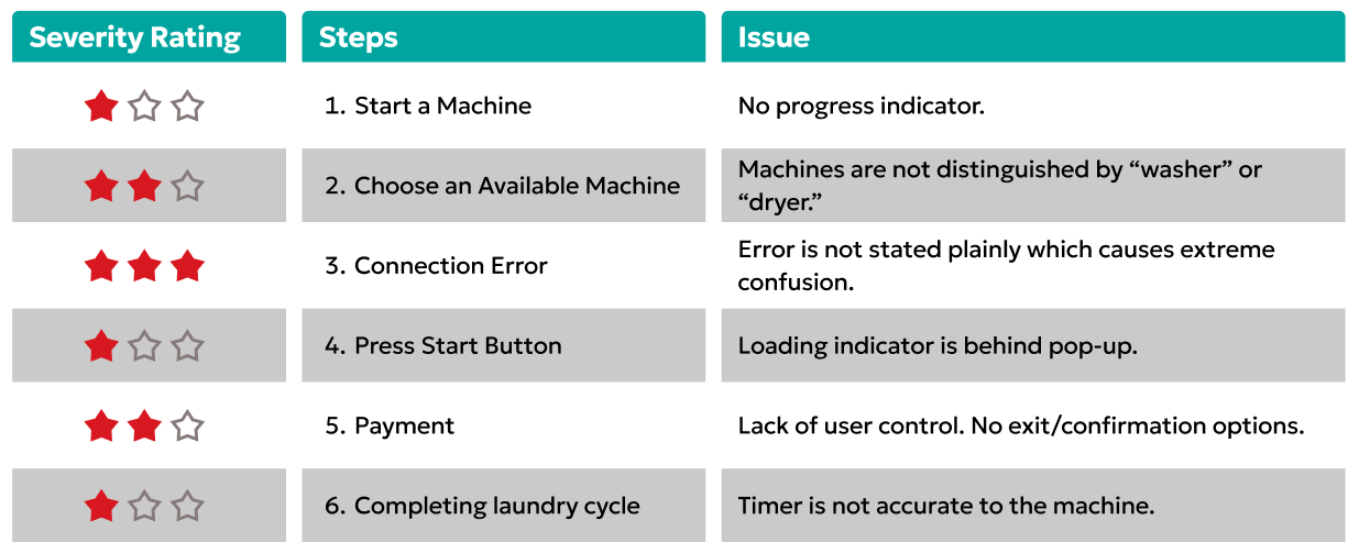
Severity Rankings
After completing our walkthrough, we went through the steps in the flow that failed and gave each a severity ranking to identify the more severe issues that should be fixed first.
Findings Summary
🤔Assumed User Knowledge
- Assuming the user has prior experience starting a washing machine leads to inconsistent user experiences
❌ Insufficient Feedback
- Lack of feedback within the app leaves users feeling stranded and without clarity
📱 App vs. Real World
- A clearer announcement of the shift from the app to the physical world would reduce confusion and enhance the user experience
📊 Competitive Analysis
In our last method we discovered severe usability issues within WASH-Connect. Competitive Analysis was chosen as our next step because we wanted to learn where competitors sit in the market, find gaps of opportunity, and use them to strengthen WASH-Connect's design. Read the full report here.
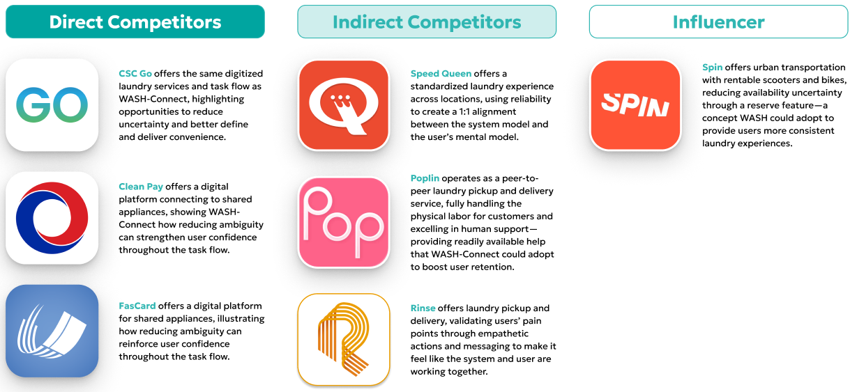
Our Competitors
Scope of Analysis
💎 Value Proposition
- The unique benefit a product or service provides, who it serves, and why it stands out from alternatives
💼 Business Strategy
- The long-term plan that outlines how a company creates value, competes in the market, and achieves its goals
💻 Usability
- How easy, intuitive, and efficient a product is to use, as well as the overall satisfaction and perception users have when interacting with it
Insights
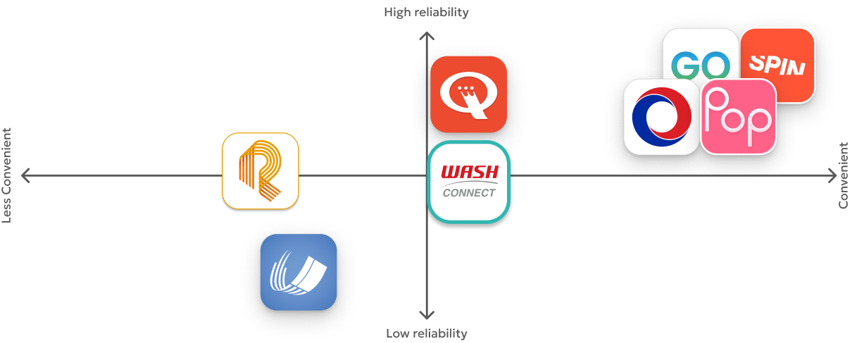
While WASH-Connect holds significant operational scale in the laundry market, competitors outperform in terms of reliability and convenience. This is a significant issue considering WASH-Connect's value proposition is "Laundry Management Made Easy!"
Competitor Perceptual Map
Recommendations
🎯 Strategic
- Better alignment between the app and laundry room
- Shift from reactive error states to visible system boundaries
- Acknowledge communal friction and design for shared reality
💻 Product Design
- Require explicit confirmation and visible transaction state to build trust and give users control
- Error messaging should include what is wrong and how to fix it
- Separate washers/dryers along with color-coded availability to give users clarity
🧩 Features
- Allow users to reserve a machine before entering the laundry room to prevent availability uncertainty
- Provide a visual countdown on the user's lockscreen for a clear sense of progress
- Add a chat option for users that need quick assistance
🌳Tree Testing
After completing our expert evaluations, the next step was to confirm our insights with user evaluations. Go through our full User Evaluation report here.
The first method we chose to perform is a Tree Test because we wanted to validate our hypothesis that WASH-Connect's current information architecture gives users unnecessary confusion and frustration.
We used UserTesting to test 60 users on WASH-Connect's main task flows (starting a washer and dryer, adding money to account). My role in this test was to analyze the data and translate it into actionable insights.
Insights
🔀 Users Expect Multiple Pathways
- 35% of users selected the "Availability" tab instead of the "Start a Machine" button when asked to start a machine
- Different users have different mental models, so these expectations should be met to reduce confusion
🛡️Users find the 'Account' tab more trustworthy
- Users primarily chose to go through the 'Account' tab when asked to add funds, rather than the 'add funds' button on the home screen
- 100% of users completed this task, so this functionality should be left as is
🗣️Qualitative Testing
We next chose to do Qualitative Testing to help us understand the 'why' behind user behavior identified in the Tree Test and why users encountered friction.
We asked 6 participants via UserTesting to think-aloud while completing the main tasks (previously defined in the Tree Test) in WASH-Connect. My role in this test was to analyze the data and translate it into actionable insights.
Insights
⚠️Unclear Feedback Makes Users Cautious
- Immediate payment deductions without feedback made users feel the interface has financial consequences
- This can be fixed with clear feedback and confirm/cancel options to give users a sense of control
🤔 Blurred Digital vs. Physical Boundaries = Confusion
- Users struggled to determine when to disengage from the app versus remain in it
- Clarifying these boundaries will create a less confusing, more cohesive experience
📱 Lack of Utility Causes Frustration
- Users said they would prefer to just complete the task directly on the physical machine
- The app should act as support, but it's currently perceived as a barrier
📈Quantitative Testing
The final evaluation method we chose was Quantitative Testing to validate whether our redesigned UI improved usability and task success rates.
Our redesigned UI was based off of the insights found in the previous methods, including clarity of washer versus dryer, availability status, and a transaction confirmation screen.
We used OptimalWorkshop to have 42 participants complete the main tasks in WASH-Connect with our redesigned UI. My role in this test was to analyze the data and translate it into actionable insights.
Insights
⚠️Visually Similar Icons & Colors Compromise Functional Clarity
- When trying to start a washer or dryer, users tend to select one of the three primary home screen buttons, despite only one being correct.
- Choices should have more contrast for faster decisions and successful task completion
🤔 Bright Call-To-Actions Distract from the Main Task
- Users selected the 'add funds' button at inappropriate moments in the main task flow, leading to them getting lost
- This button should support, not distract, from the core flow
📱 Users Don't Read,
They Skim
- Despite labeling and icon distinction, users still struggled to differentiate between washers and dryers
- There should be bolder, distinct visual markers for guidance and quick decision making
👉 Next Steps
The poor usability of WASH-Connect poses a significant risk to their brand reputation and client retention, directly violating the "Laundry made easy" value proposition. Intervention is needed to mitigate potential business loss to competitors that already have these features implemented.
The following recommendations should be followed up with more user research, like A/B Tests with alternative home screen layouts and Qualitative tests with real-world usage in physical laundry rooms.
❗Implement a Clear Visual Hierarchy
- Remove unnecessary buttons and use high-contrast colors for better distinction to reduce user confusion
❗Give Users Clear Feedback
- Explain system errors plainly to prevent confusion
- Add confirmation screens to build trust
❗Add System Transparency Features
- Implement features that direct competitors already have, like real-time balance updates, to strengthen user trust
❗Increase Efficiency & Usability
- Limit user frustration by clarifying the first step to start a machine and reducing the amount of switching between the app & real world
✍ Project Learnings
- Embrace the unexpected
User testing rarely follows the script. While this is something I've learned in the past, this project was a good reminder that real-user behavior is often messy and unexpected. Conducting user testing was key to helping us get past our assumptions and really learn what users need. - Task Completion > Aesthetics
A large issue with WASH-Connect's UI is that the colors of primary actions are not distinguished enough. While it looks nice, it causes users to fail from the first step. This is something I will remember for future projects.